 Gabriela Véghová
Designing for timeliness
When doing user research, there are not too many complaints that are as universal as ‘The system is simply slow, it’s slowing me to do my job’. Often this issue is dismissed by saying there’s nothing that can be done about that without significant engineering effort, complete rewriting the code or moving to a different technology. Trying to estimate that, the issue can easily get to the bottom of the backlog. But does it have to be like that? Aren’t there ways which allow us to create fast and efficient systems without relying only on the computational power and the time complexity of the algorithm? Is there anything we, as the designers, can do to make it any better?
What we consider as a fast system
Let’s ask what needs to be done to our system can be considered as fast by our users. In general, the expectations are different in each situation, not too different from a communication among people. In a general conversation, we expect people to respond promptly, especially when the question was simple and the person doesn’t need to think too much about the answer. When the question was more complex, we naturally give the other person more time for thinking, narrow it down or provide additional hints that may possibly be helpful. Also, the answering person tends to show that he or she is thinking by a variety of gestures, changing the posture and filler sounds like uh or okay.

It’s not too different for the systems. For the commands we expect to be simple, we require an instant answer while we accept longer time for finishing a complex computation. But even ‘instant’ can mean different things. We are way better at noticing a short sound (from 1 millisecond) than a short view of an image (0.1 second) and usually respond in less than a second in a verbal communication[1]. For displaying information on a screen, there are several industry standards, usually requiring the response on simplest input like click or pressing a button to be between 0.1 and 0.2 seconds[2]. Having in mind the issue date of this standards, today’s applications should not exceed 0.1 second. For more complex tasks, like loading a website, the acceptable time is longer, though getting significantly shorter over time, from 15 seconds[3] to 4 seconds[4] to 2 seconds[5] and we can assume we should reach for 1 second or less now. Also, we can expect this time to go down to 0.25 second in the future[6] However, there still will be tasks that are more complex than loading a website, like setting up a complex system or performing computations on big data sets when longer loading times are expected and acceptable.
Aspects of timelines
There are several aspects on timing we can work on. You can guess that easily when looking at words we are using to describe timing: considered as fast; we expect people to respond; we require an instant answer; from 1 millisecond, the acceptable time is longer… Looking more closely at them, we can divide them to three basic categories:
- Talking about the real time needed to perform an action, like 1 second,
- describing how do we perceive the elapsed time, like the loading of a page is considered as fast,
- and tolerance, like the rendering of supermassive black hole M87* took days, which is totally acceptable for assembling 5 petabytes of data into one picture.

We, as the designers, can do something for each of these aspects.
Real speed of a system
Even if we’re not writing the computing algorithms ourselves, we can cooperate with developers and architects to build them and present the results in a smarter way, so the real time the user needs to spend on the task is significantly shorter. Examples of what to think about:
- Knowing what’s really important and computing the important part only, or working on the important part first. This may include working with best guesses and predictions of what the user really wants to see. For example, when you are starting a weather application, show only models for the day and only then the following days. When starting a GPS, load the updates of the nearby area only.
- Knowing how much detail do we need to show. When computing a weather model, range of 1° is often precise enough. When computing the fastest route for walking to work, nobody notices whether it’s 30 seconds longer. Think on how much precision does the user really need for his use-case. Does the 5% of humidity make any difference when the user is considering whether to take an umbrella?
- Deciding what to compute first and what can be left for later. Show distorted picture first and only then show each pixel. When looking for a specific file on a drive, show the ones found in the most used folder first, only then the rest. You may change the order and show the ones in rarely used folders later. When loading a website, show the main content of the first article first. Nobody’s looking at pictures of the 7th article anyway.
- Think whether you really need these fancy media. Does this huge picture, video or complicated animation on the first page provide that much value that you’re making the user wait five seconds for it?
- Also, does the user need to know that the process is going on? A background process takes zero time from the user and you can still do the backup, install updates, keep recomputing the number of items in the stock and synchronize data. Just don’t forget to provide all the important information, like ‘if you turn of the computer, your backup will be paused’. Also, it’s polite to ask the user whether we can invisibly use the resources on first start.
- If you cannot keep the whole process on background, you may do so with some part of it. Finish the saving of your document minutes after the window with it closed and let the user work with a different program. Let the process run and show a notification with the outcome, if the result is the only important thing.
- If the user needs to perform a set of actions, let them do all of them at once and don’t make them wait to perform each separately. There’s nothing worse than make a click and wait for two minutes, make another click and wait for three more minutes. Also, it’s highly probable that the user is not really paying attention and waiting for the next step so the overall process will take much longer. Make them better do both clicks at once and let them make a caffee during the five-minute wait.
- Do not disrupt the user’s flow[7] with unexpected messages, pop-ups or unneeded notifications. Disturbing concentration on a task can make the work significantly slower. So makes it any cryptical language that takes significant time to comprehend.
Perception of speed of a system
After we make sure that the real time needed can’t be any shorter, we can work on how is the waiting perceived. The general rule is that occupied time is perceived to be significantly shorter that waiting time. A great example is waiting the kettle boil[8], when you start boiling a tea in a kettle, staring at it until it boils feels like eternity. On the other hand, if you start doing something else, like checking the email, the time until it boils passes really quickly. Same principle is applied when putting mirrors into elevator lobby[9] and you can do the same by:
- Think about something meaningful the user can do while something is loading or processing. Allow them to do another task in the other parts of the system or prepare them to the next step.
- When loading a number of results that will be reviewed, show them one by one as soon as they are ready. However, keep in mind that a couple of waitings is perceived to be longer than one longer so make sure that the partial results are actually usable and will keep the user occupied.
Another principle that affects the perception is that we remember the end of the process the most, then the beginning and the middle of it is not that remembered. That’s why making the progress bar speed up a little on the end results in users perceiving the process as faster overall.
Thresholds for perception
There are a couple of thresholds in perception of waiting that work pretty universal among people and some good practices how to work with them[10]:
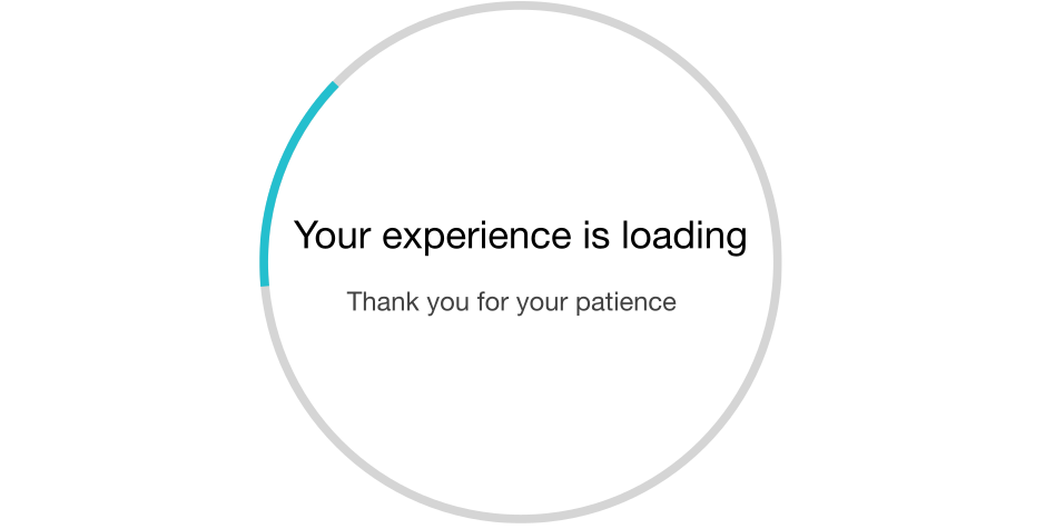
- When the waiting is less than 2 seconds, it’s perceived as an instant and no progress indication is needed.
- When the waiting is between 2 and 5 seconds, the waiting is noticed and it’s needed to show that something is happening and the computer is not stuck. This can be a spinner, hourglass or pulsing busy button.
- When the waiting is between 5 and 10 seconds, the user is losing the attention (the attention span is approximately 7 seconds[1]) and needs to see how is the progress going. That’s a good reason to show a progress bar.
- When the waiting is longer than 10 seconds, the user has lost the attention and needs to know when to get back to the task. You can expect them to go and do something else, whether it’s a different task in the system, using a different program or making some tea. In this case, show them expected end of the task to decide which action to start and possibly a notification when it’s done. Also, give them the option to cancel the task.
Also mind that all these durations are slowly shrinking and what was perceived as short a year or two ago may not suffice today.
We expect time values to be rounded
When talking about time, we tend to use a couple of anchors[11] which are 1, 2, 3, 5, 10, 15, 20, 30, 45, whether talking about seconds or minutes. When using different time durations, we tend to perceive them as weird and make the user wonder whether it’s really true. And that doesn’t help making them the task any faster. When there are different aspects that can affect the duration, it’s handy to use time ranges consisting of two time anchors that are next to each other. That makes the user even less stick to particular expectation.
Can microinteractions save it?
You can definitely make some enhancement in time perception by using a small number of precisely picked microinteractions or microanimations. One example is showing a small animation when the system is booting up and there’s no other meaningful thing to show. It can make the user attention occupied for a couple of seconds - but not more. Also mind that more sophisticated animation with more potential to occupy user’s attention tend to be larger and therefore slow down the loading again.
Another good practice is using a transition animation for moving screens or turning pages when the time of the animation is exactly the same as time needed for loading. That makes the application look a bit more more fluid and can take some user attention, too. However, this approach doesn’t scale and trying to come up with a lengthy animation showing up over and over again may easily annoy the user.
Tolerance of speed in a system
After we’ve done all to make the system perform fast, and designed it to appear fast, we can still work on user’s tolerance - usually by explaining them why it still takes some time. Again, it’s not too different from a human communication. When we ask a difficult question, like ‘What was your biggest professional accomplishment over past 3 years?’, we naturally give the person more time for thinking than after giving a simple question like ‘What’s the time?’. And we expect the same thing from a computer.
When it’s not obvious that the task is complicated, we can easily remind the user, eg. by saying that we’re not just searching for the results, but we’re searching hundreds of thousands of records to show the results. Also, if we’re doing a couple of actions at once, it’s fair to show that we’re not only exporting the results, but also computing the values from thousands of inputs in a database and validating the results before exporting them. If the lengthy complicated task is only the first run of a process or application, that’s also a good reason to remind the user that next time it’s supposed to be quicker.
We can also point our focus on the remaining time rather than elapsed time, which tends to remind the user how lengthy the process was. That means if we are showing any time information, it may be good to hide how long the waiting took. We just should be careful about the cases, when the user really needs to know that, eg. during an expensive intercontinental call.
Another way how to increase the tolerance is to fulfill, or even better, overdeliver the initial estimate of waiting. Similarly, underestimating waiting time drastically decreases the tolerance so when unsure, always use the longer estimate. Do not forget that even showing 100% done for a couple of seconds after the process is a kind of underestimating. The user expects everything to be finished as soon as we say it’s 100% done so it’s better set the highest value for any progress bar to 99%. If we really cannot estimate remaining time with a reasonable confidence, to make sure we’re not underestimating the situation, we can be transparent and show how many items are remaining from initial number (eg. copying item 10 from 100).
The last thing to enhance transparency and general acceptability of the piece of software is to be honest. When something goes wrong, apologize and tell the user about it reasonably soon.
Why fast system is not enough
Getting back to the initial complaint, mind that the speed itself is not the main issue. The issue is ‘It’s slowing me to do my job’. I wouldn’t mind working with a not so fast system which allows me to finish what I need in a timely fashion and go home soon. There are moments when working on timing is not as efficient as focusing on the flow of the end-to-end job and information architecture of the system. A general advice is to always start with the big picture and the goal of the task before diving into timing.
[1] Jeff Johnson: Designing with the mind in mind: Simple Guide to Understanding User Interface Design Rules, chapter 14: We have time requirements
[2] Steven C. Seow: Designing and engineering time: The Psychology of Time Perception in Software, chapter 3: User and System Response Times
[3] Jakob Nielsen: Guidelines for Multimedia on the Web
[4] Akamai and JupiterResearch: Akamai And JupiterResearch Identify '4 Seconds' As The New Threshold Of Acceptability For Retail Web Page Response Times
[5] Jason Buksh: Web Response Times https://www.perftesting.co.uk/web-response-times/2011/10/08/
[6] Scott Barber: Acceptable application response times vs. industry standard
[7] Mihaly Csikszentmihalyi, Flow: The Psychology of Optimal Experience
[8] well-known expression
[9] Joanie Faletto: There Are Mirrors Next to Elevators for a Specific Reason https://curiosity.com/topics/there-are-mirrors-next-to-elevators-for-a-specific-reason-curiosity/
[10] Chris Kiess: Guidelines for Time Indication and Progress Bars in User Interaction Design
[11] Steven C. Seow: Designing and engineering time: The Psychology of Time Perception in Software, chapter 7: Expressing time
 veghova.gabriela@gmail.com
 Gabriela Véghová