Honeywell is a global company with four business units and over 100 000 employees. The Aerospace business unit focuses on integrated avionics, engines, systems and service solutions for aircrafts.
As a part of Flight Support Services team I was responsible for the usability of iPad applications helping pilots with important decisions during the flight. I also helped other teams with design of different other aerospace-related products, such as autopilot, data analysis dashboard for connective black boxes, installation tools and several internal tools.
Electronic Flight Bag applications
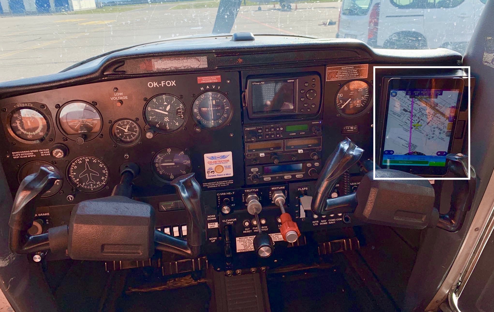
Electronic Flight Bag (EFB) is a tablet storing documents needed during the flight, mostly flight plan, manuals and checklists. It is also possible to run an application that would show real-time data and do precise computations for the pilot.
The designing for such devices has several specifics based on regulations and the context of usage. For example, the number of colors and shapes is limited and each of them has a specific meaning, selected font type and size needs to meet strict criteria for visibility and after each significant redesign the application needs to pass certification process with numerous sets of usability tests.

credit goes to my friend Nikita Kot, airline pilot cadet
GoDirect Flight Optimization
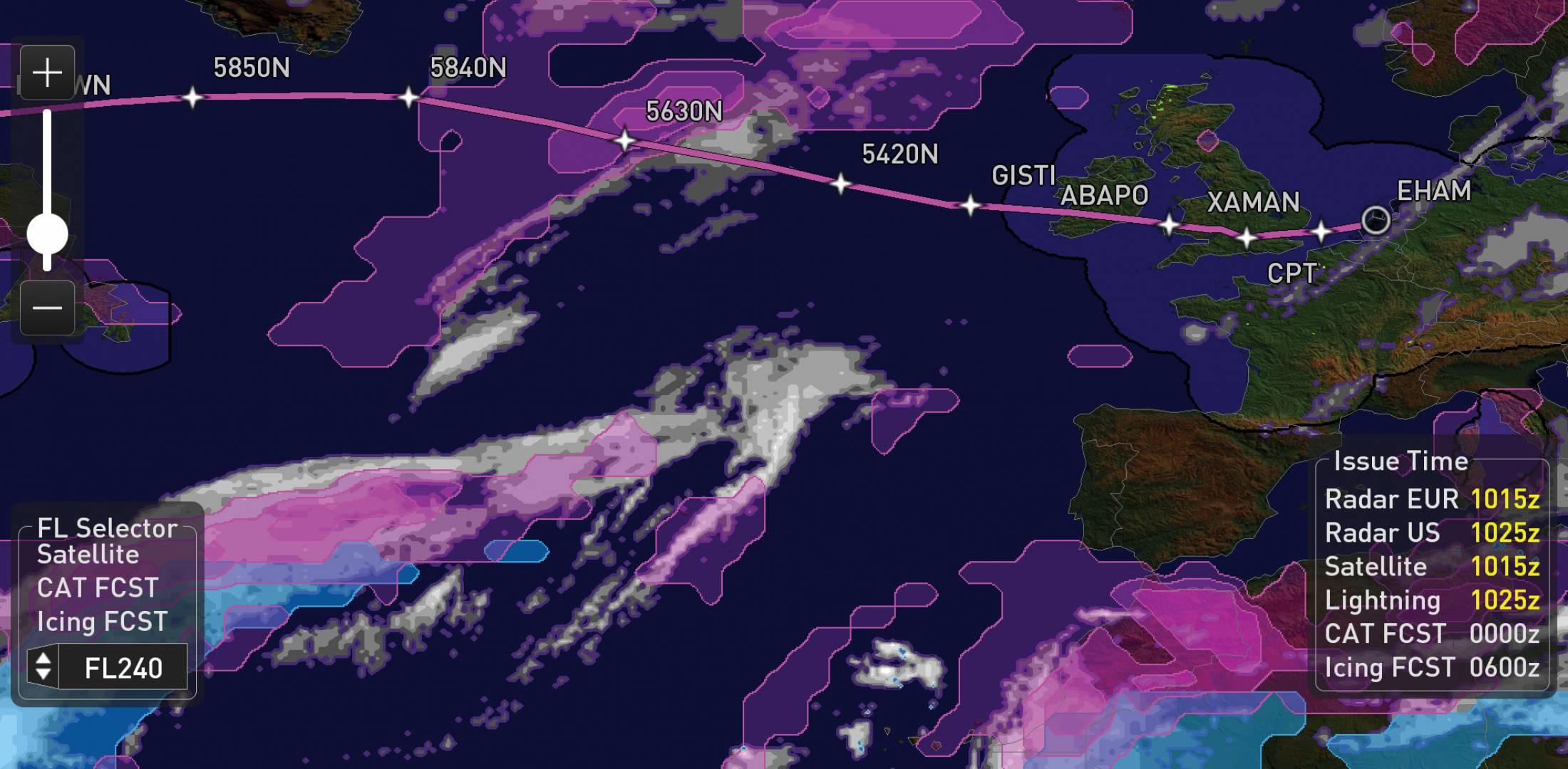
GoDirect Flight Optimization helps to choose the most convenient flight levels for the whole flight. It loads all available data, including the most up-to-date weather forecast and provides visualisation of the possibilities to discuss with the air traffic control.
I was responsible for the design of the whole application, starting with understanding the flying context and constraints, testing hypotheses and use-cases, creating and using personas, designing user flow, interaction and visual design, usability testing and usage analysis.
Weather Information Service
Weather Information Service shows detailed weather observations and forecasts in order to obey dangerous spaces and to enhance comfort for the passengers by avoiding turbulences.
I regularly consulted the design and performed minor usability tests.

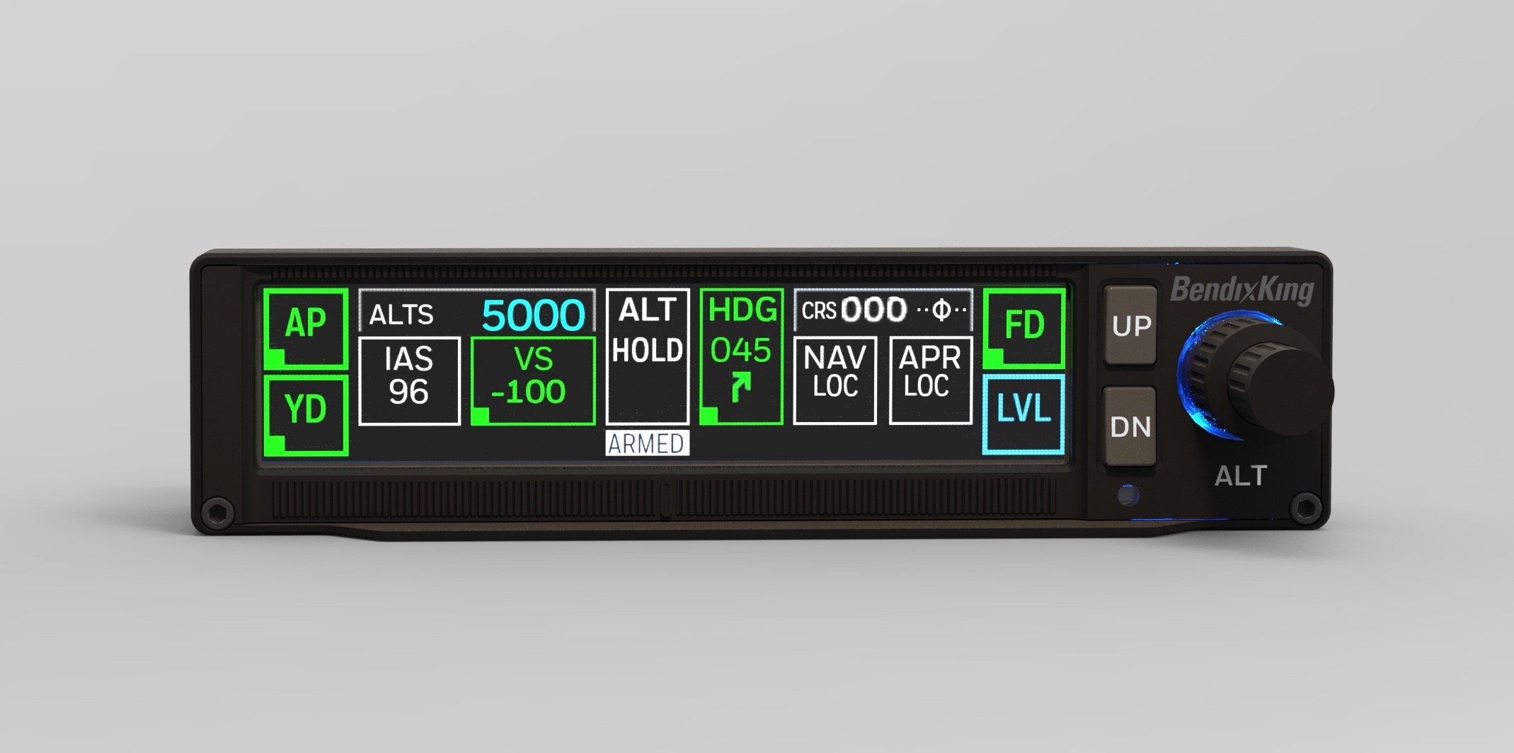
AeroCruze 230, the first touchscreen autopilot
Using touchscreens for primary display in cockpit is getting more and more common. However, all the autopilots were still using physical knobs and buttons until now. The reason behind not switching to touch was the fear of degrading the usability and safety of the flight. After designing AeroCruze the usability tests turned out that the touch display is not just more intuitive, but also less prone to error and therefore safer.
I designed the final visual version of the display and the process of its calibration. I closely cooperated with the hardware team to make sure that the design considers all technical constraints and takes the full advantage of the technology and meets all industry regulations.

I also designed the installation and diagnostic processes with a desktop application. The application enables the user to seamlessly connect the data sources with the autopilot, track any unpredictable behaviour and propose the solution in case of an error.
Black Box in the Sky
Black box in the sky is a new-generation black box, which can send flight data to cloud in real time. I designed a web application dashboard, which can visualise distinct signals as well as complex alarms or movements of a whole fleet.
 Gabriela Véghová

 veghova.gabriela@gmail.com
 Gabriela Véghová